Intro
In recent days, commuting has become a lot easier and a lot cheaper. Thanks to all the services and the apps out there which help to commute faster, save time, and also at a low expense. I was using the Bounce app which basically helps us to book scooters, pick them up, ride them & drop anywhere, and was facing many problems. In fact, it’s such a crazy idea thŚat it has broken so many records and has been growing a lot since then.
Well, they have changed many things, but still, a lot of things need to be addressed and this is my small effort in providing the solution for the problems that the users are facing when using this app.
Let me start with a story. I was using bounce regularly before I actually bought my own vehicle. But after I bought my own vehicle, I have just used it once since then. And it’s just been a month since I bought the new vehicle. Even though when I am not using it off lately, I was hearing what other people used to talk about Bounce when they use it and even others were also facing the same problems that I was facing. So, I decided that since I am a UI-UX Designer, why not give a try and give a solution to as many problems as I can. In fact, this doesn’t mean that Bounce is doing bad, it’s just my way of thinking and after reading this, it doesn’t mean that Bounce has to change its design.
Ok. Enough of talking, Let’s dive in.
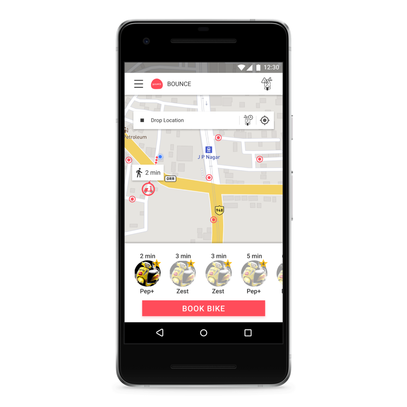
About the Case Study
So, before I actually step into the design process, I actually booked a Bounce in my free time, went for a ride for a few minutes, noted down all the things that came into my notice, and also took screenshots of the app while I am using it. When I told this to my friend, he laughed at me that I was crazy enough to spend money and so much time just for a small side project. But for me, it’s a passion.
My goals in undertaking this Case Study and Redesigning it:
• To facilitate a more good user experience for the users by providing various features.
• To design a more personable and intuitive user interface when using the app.
• To design through user empathy (Human-Centered Design).
These are the roles I assumed during the process of conducting the case study and redesigning it:
• User Researcher
• UX Designer
• UI Designer
• Product Designer
If you do not want to read all these interesting things and directly want to see my designs, you can view it from the interactive prototype below.
User Research
Before I began my redesign process for the project, I conducted interviews with 20 Instagram users to get a better understanding of whom I was designing for. It was an online interview wherein I used Google Forms. Though it isn’t the best way to conduct user research, it was a lot helpful.
These were the questions that I asked them as an interview process:
• Why do they use Bounce App & What do you like about it?
• What features do they think if it was included in the Bounce app would have made it more awesome than it currently is?
• What is currently bothering/irritating them when they’re using the Bounce app?
• What do they think can be improved when using the Bounce app?
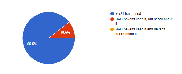
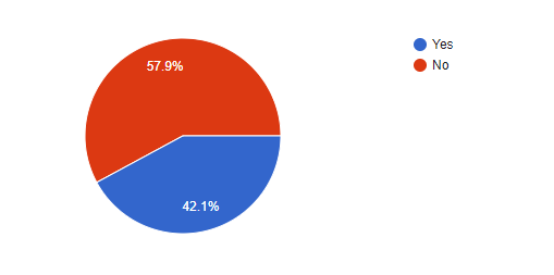
Here’s how the analysis of data looks like when plotted.
Bounce app Usage (Question: Have you used Bounce App before?)
Bounce App rating as TOP 10 most used apps (Question: Is Bounce App your TOP 10 most used apps on a Daily Basis?)
Similarly, from derivatives of above such questions, I created user personas that can be used as a reference of a typical user for using the Bounce app. For more details about the user research, check out here.
Personas of typical Bounce app user
From observing the above research data and deriving insights from it, I created personas.
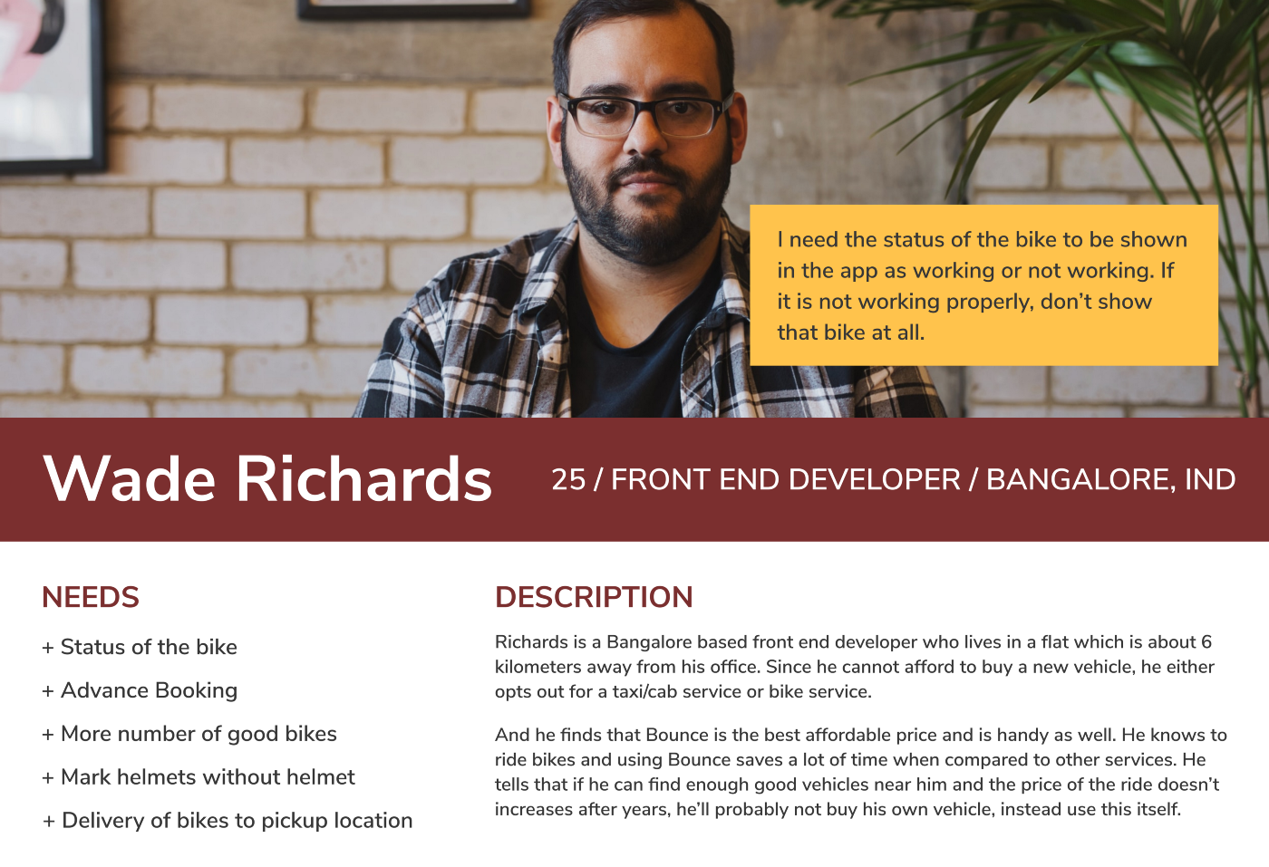
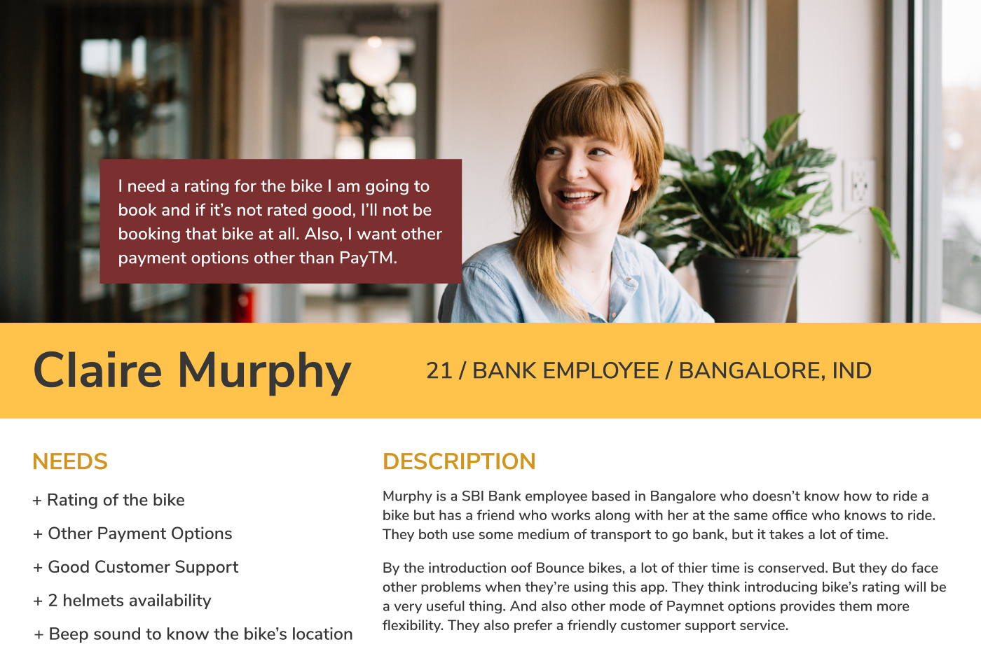
Now that you have a better understanding of who I was designing for, we can move on to the good stuff, & start designing with the actual challenges and discussions about them in detail.
User Experiences
Experience #1: The Home Page
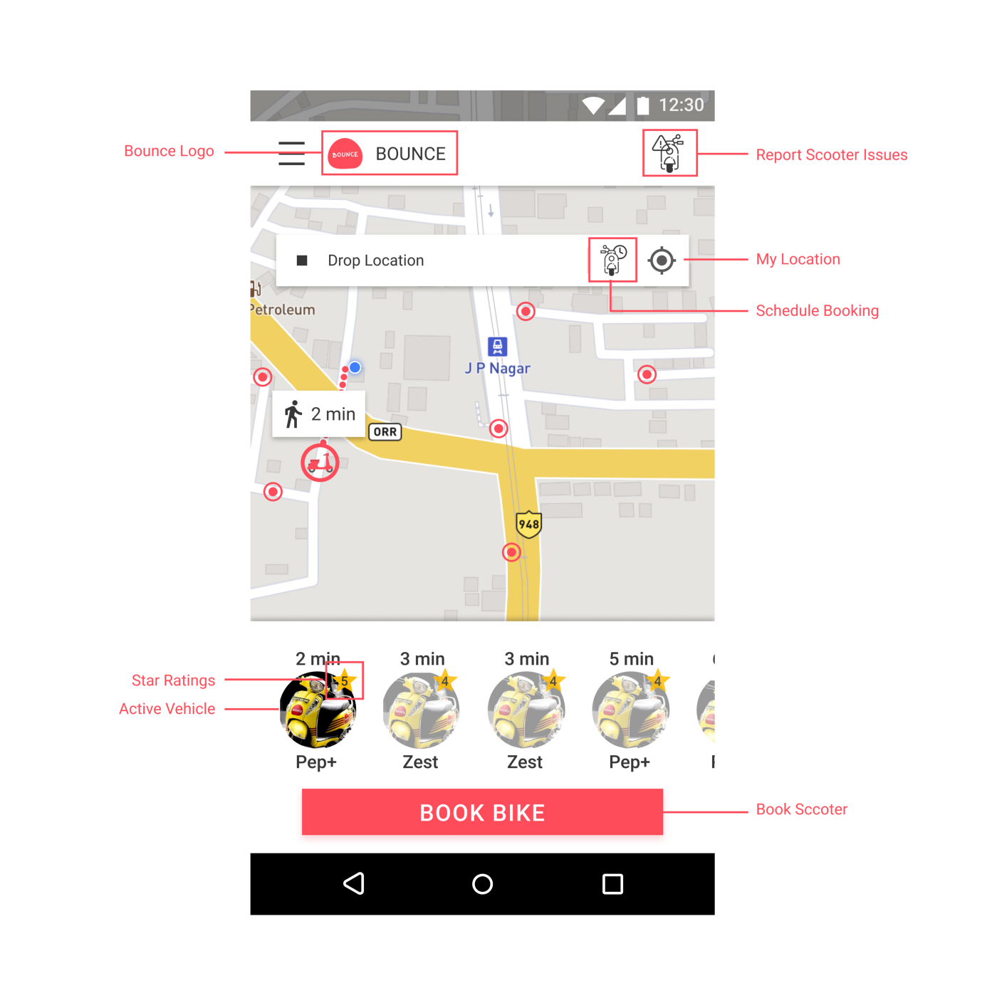
Aside from the normal functions, I decided to change the design a little bit. The major changes are as follows:
1. Introduced Bounce Logo which wasn’t there in the app before.
2. Moved Report Scooter Issues to up to maintain some balance.
3. Introduced the Schedule Booking feature.
4. Introduced Star Ratings so that users can choose scooters that have good ratings and also the company can replace bad scooters with good ones.
5. Changed the layout of Scooter Listings in a way that is easier to use.
Experience #2: Drop Location & Confirm Booking Page
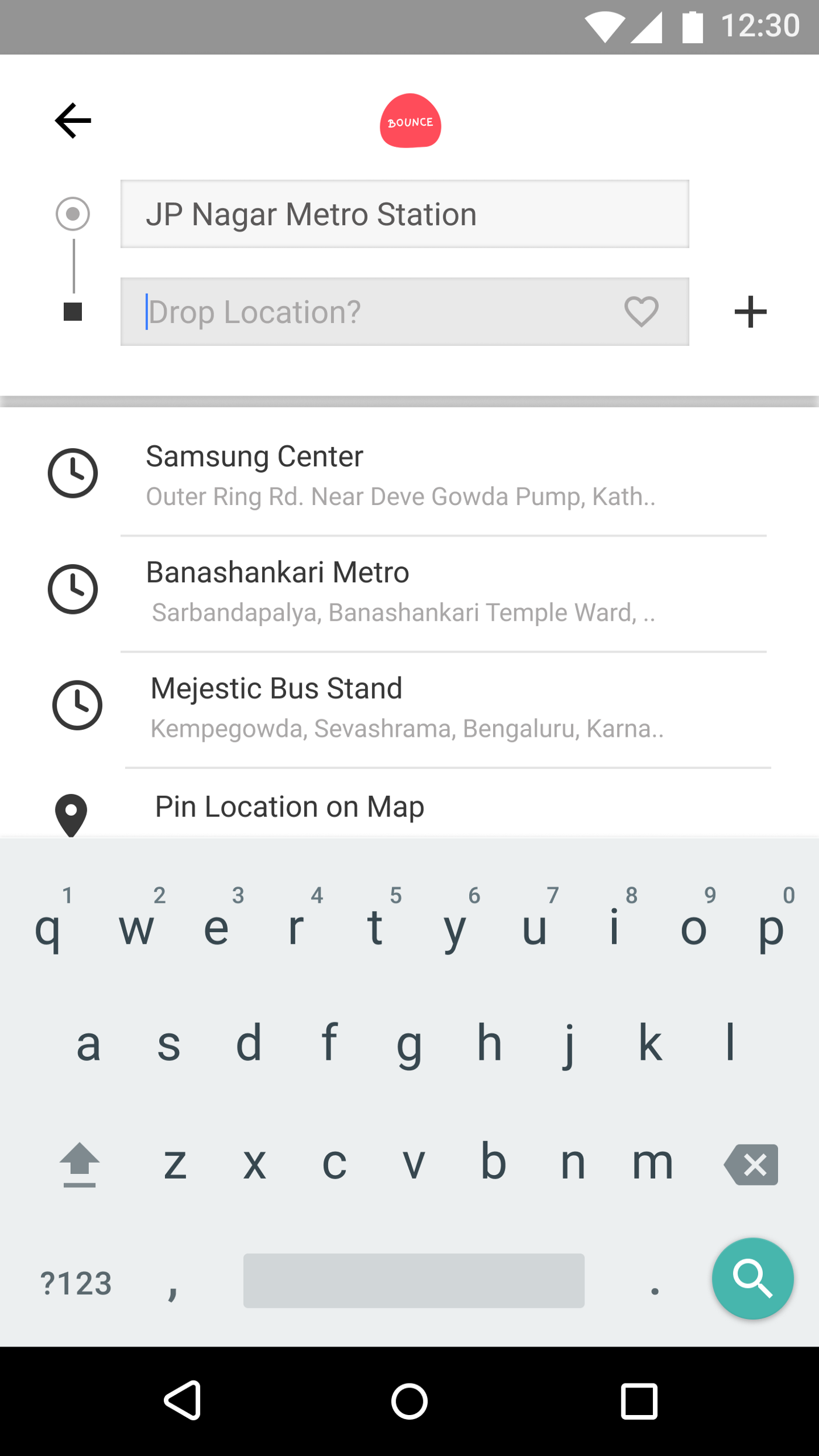
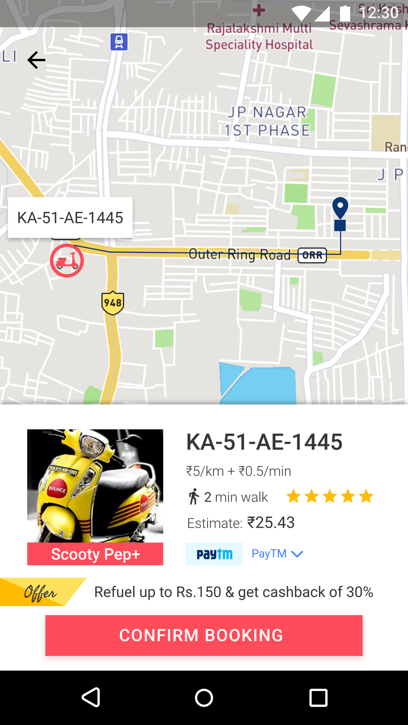
In these designs, the changes made are:
1. Changed the Layout of Search of Pickup & Drop Location.
2. Introduced Add New Stop feature next to Drop Location.
3. Introduced Star Ratings in Confirm Booking Page so that the users can decide whether they want to book that scooter or not.
4. Introduced Payment Gateway Options other than PayTM (Even though no other payment options are shown in the design, they can add a feature wherein the users can pay through whatever Medium they want).
Experience #3: Booked Scooter Page
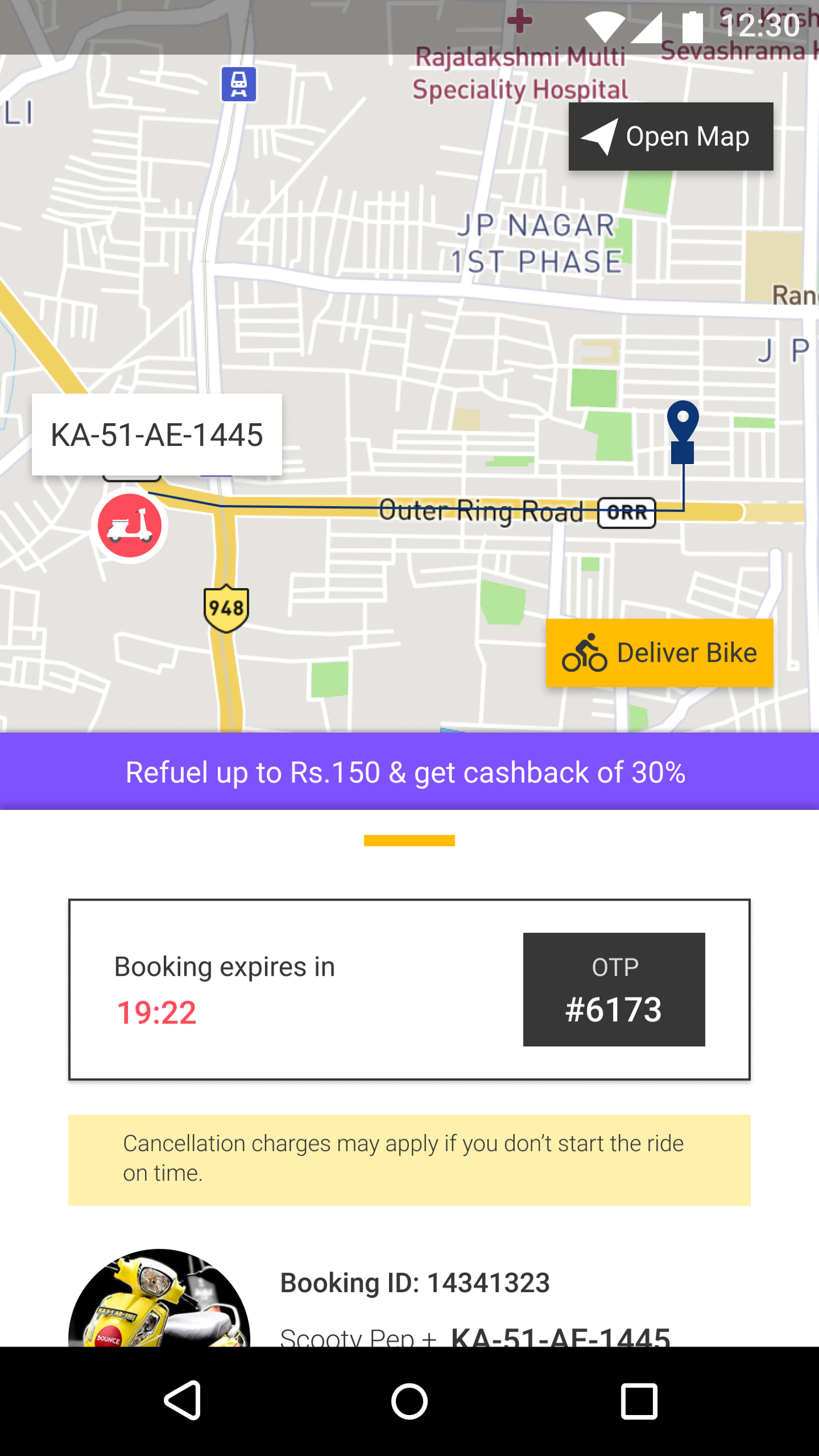
Although most of the design part is same in here, I introduced the feature of Deliver Bike here. This may be a lot harder to implement when you think in terms of the company’s perspective, but at the same time, it’s a lot useful for the users which saves them their time & energy in searching for scooters. In fact, the company can charge some amount in order to deliver the scooter to the user’s place.
And this is how I have provided the solution to it using my design as follows:
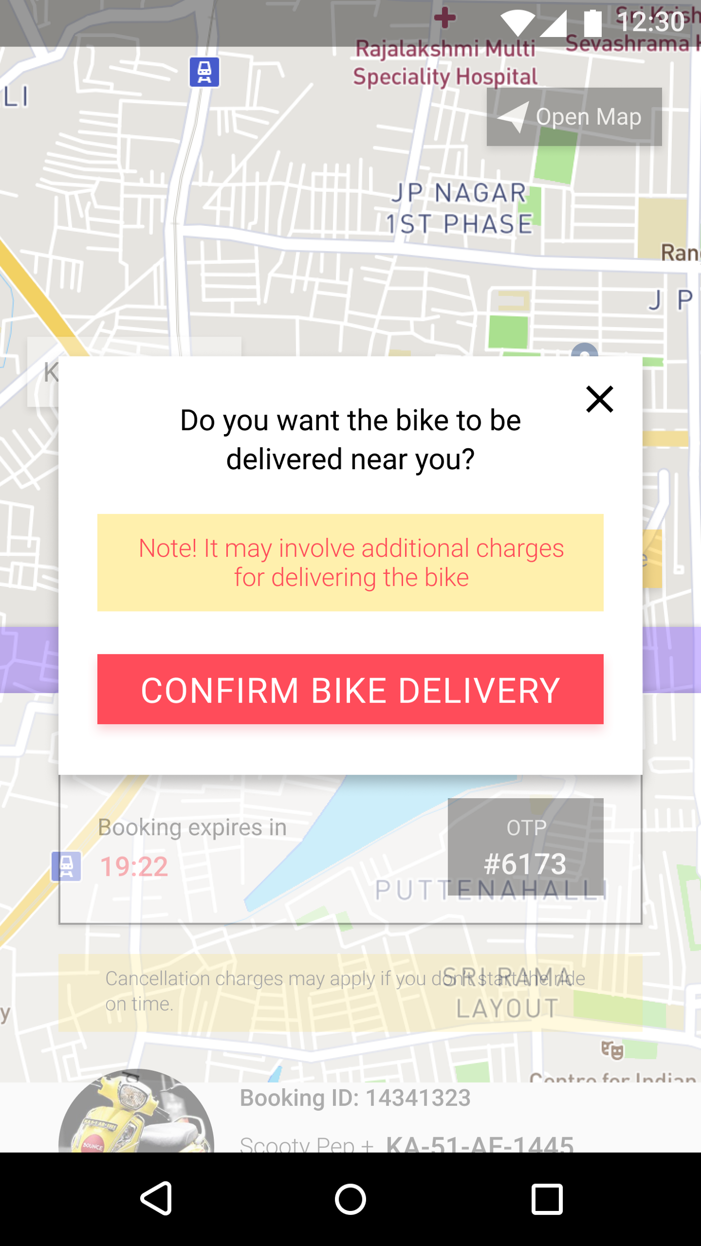
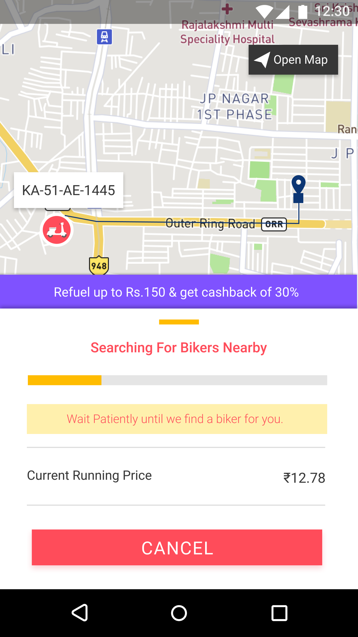
The user will get a prompt that they will be charged more when they choose to use the Bike Delivery feature. Also, when they choose to confirm to go for the Bike Delivery feature, the screen will show searching for nearby bikers & if found one will be delivered to the user. At the same time, the user can cancel at any time when he doesn’t want to opt-in for the Bike Delivery feature.
I do know that when it comes to real-world situation, implementing this is a lot harder and there are a lot of hurdles that need to be taken care of before implementing this feature. I am not going too deep on this feature but just quoted that such a feature if exists will be a lot useful.
Experience #4: Booked Scooter & On Ride Page
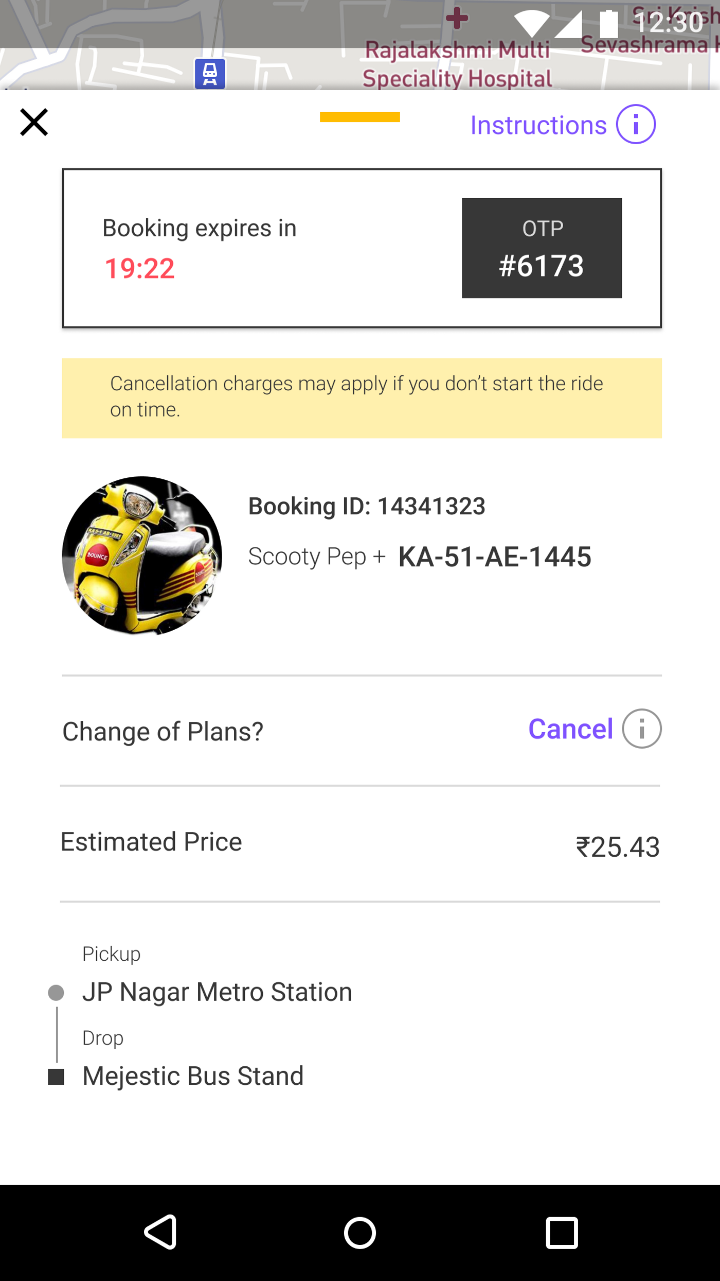
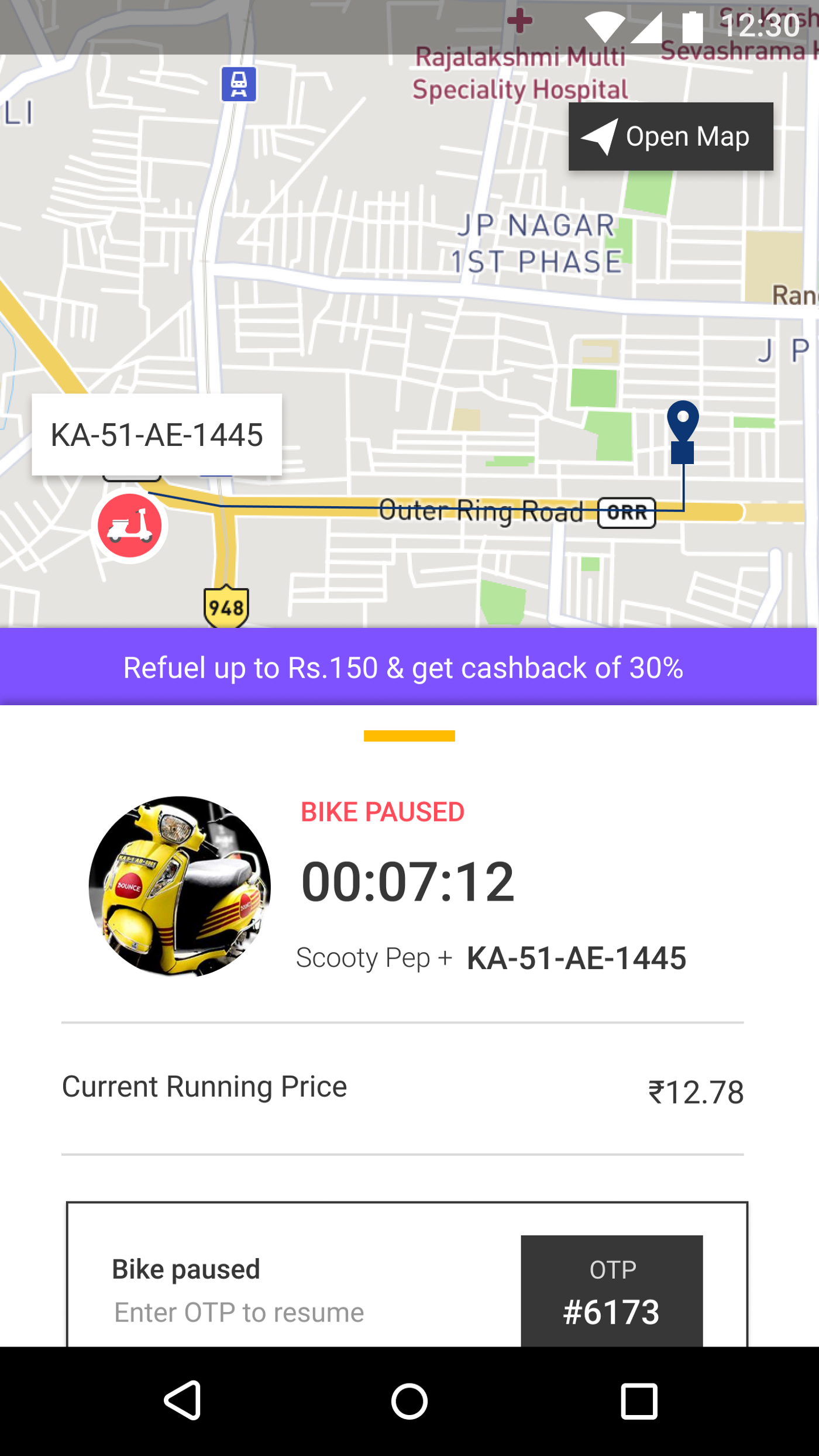
When comparing it with the app, there’s not much change in the design, but a feature of Current Running Price if introduced while they are in the middle of the ride will be a lot useful for users.
Experience #5: Finish Ride & Submit Form Page
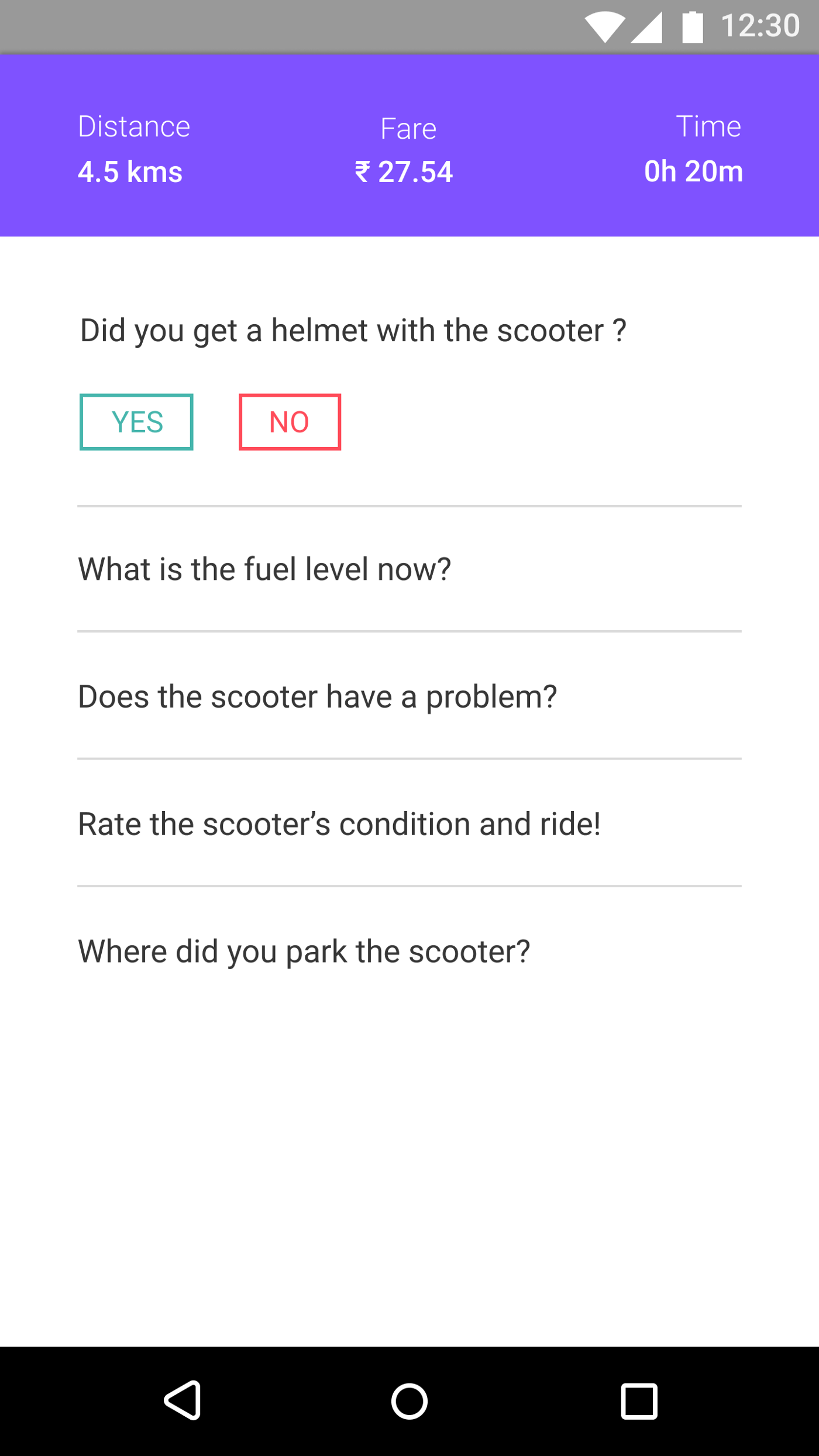
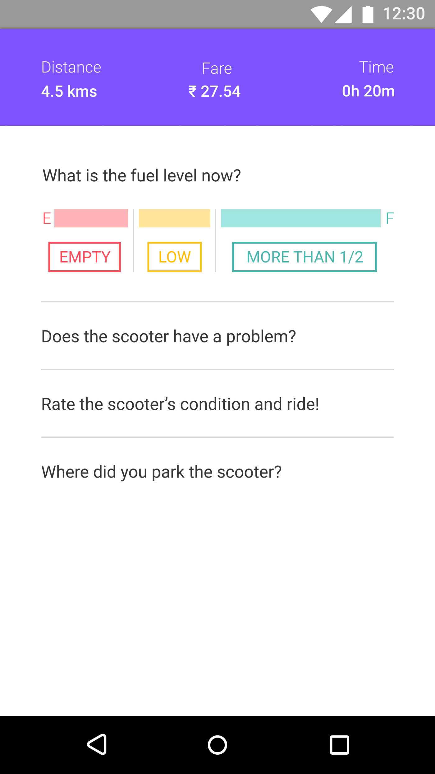
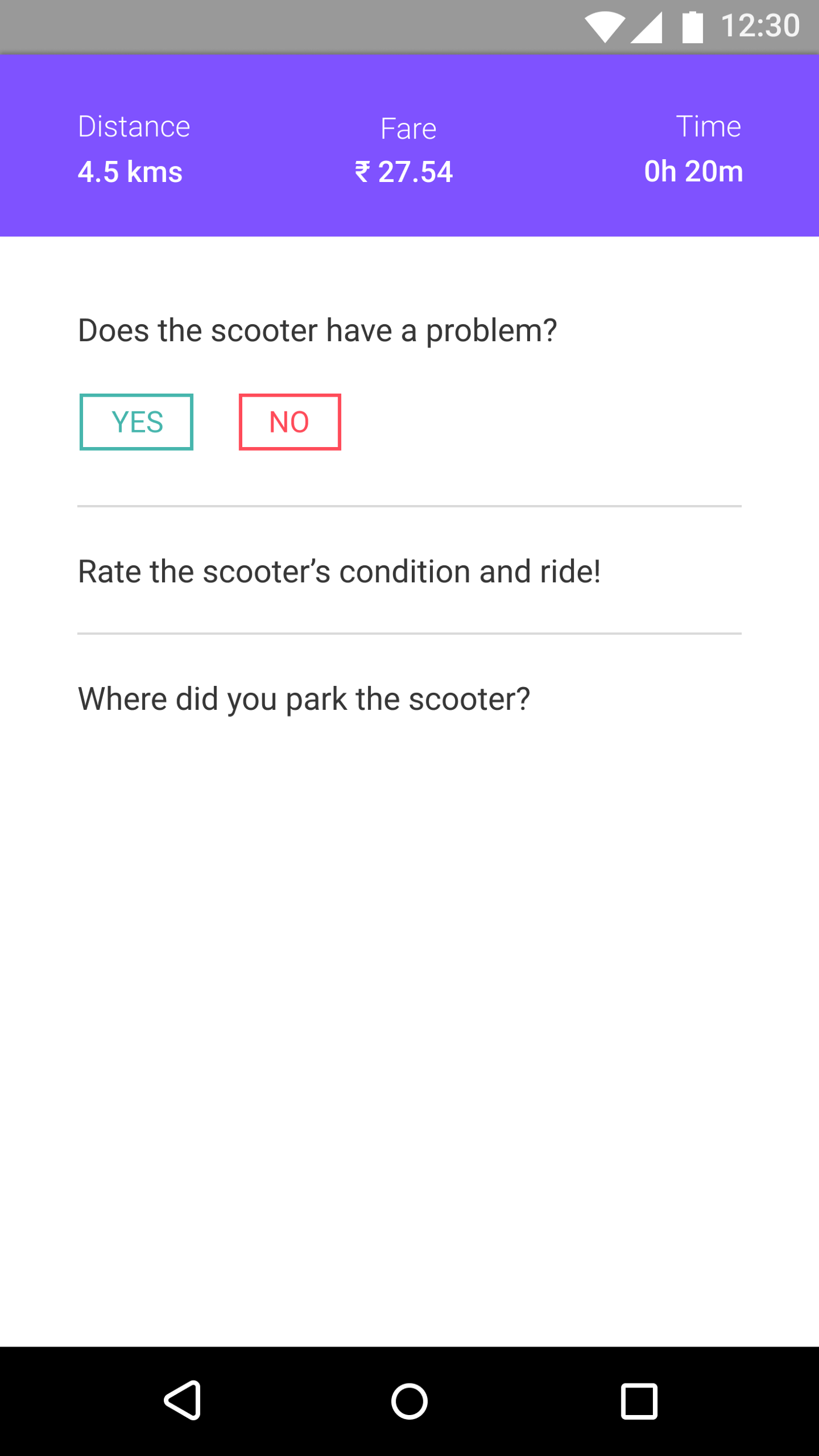
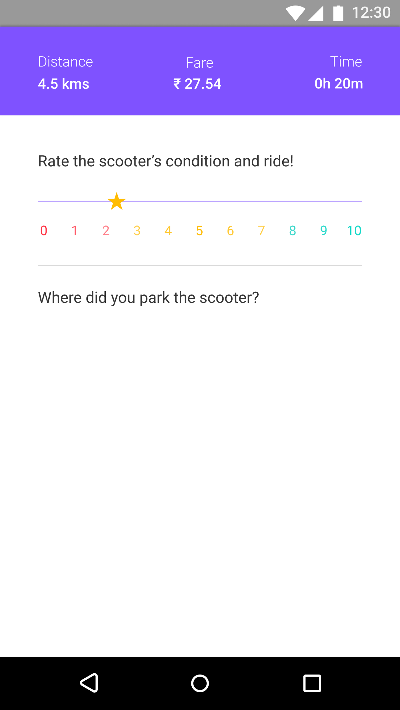
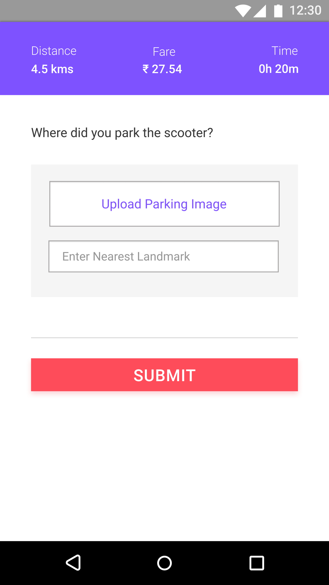
Here again, I have introduced the Rate Scooter feature wherein after the ride, the user can rate how the scooter and its condition within the range of 1–5.
Experience #6: Schedule Booking Page
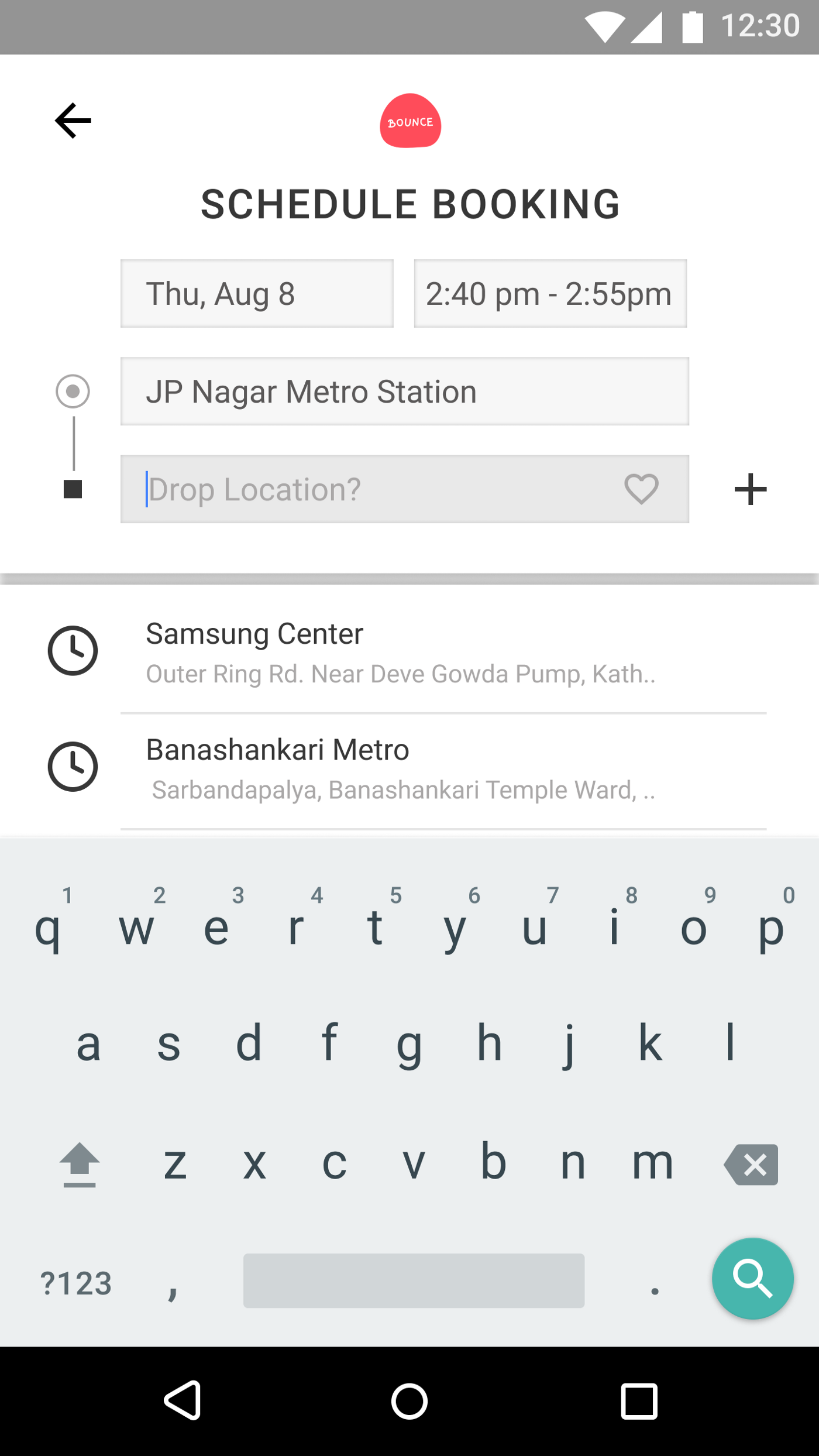
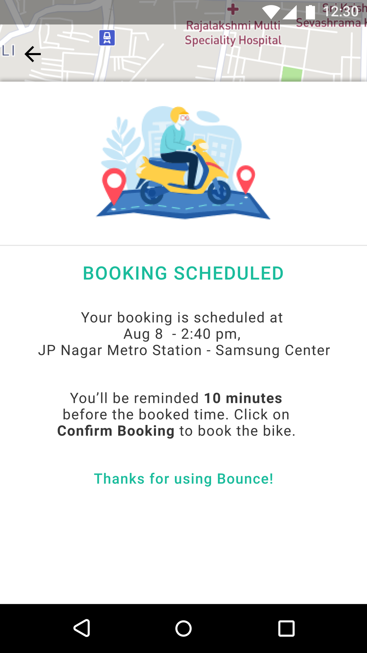
Here, I discuss the solution to Schedule Booking Page. Well, again this might be a bit difficult to implement. But again, we can use this feature to help users remind them with a notification 10 minutes before for the time they have scheduled. The notification leads the users to confirm the booking page wherein the scooter will be booked and the user can take the next necessary actions.
These are all the designs that I created using Figma which is an amazing tool for collaborative designing. Even though I didn’t collaborate with anyone, I used Figma because I like using it a lot.
Here’s the final UserFlow using high-fidelity design:

For a more detailed view, you can check out the entire UserFlow here.
Final reflections on the work that I have done
I have almost discussed all the things that I did in order to make the user experience more engaging & worthful. On doing this project, I learned so much that I couldn’t have learned if I kept on watching videos & blogs regarding design. In fact, as they say, practicality matters, active learning matters, doing the actual work matters and I guess I have done my part in this project.
Yes, there is more room for improvement, but at the same time, as a beginner in UI UX Design and working in a job and doing this project at side gave me so much confidence in doing further similar projects.
Haven’t checked out my prototype yet? Here it is!
And that’s a wrap for today. Thank you so much for reading. Share this if you feel it is worth reading.


